
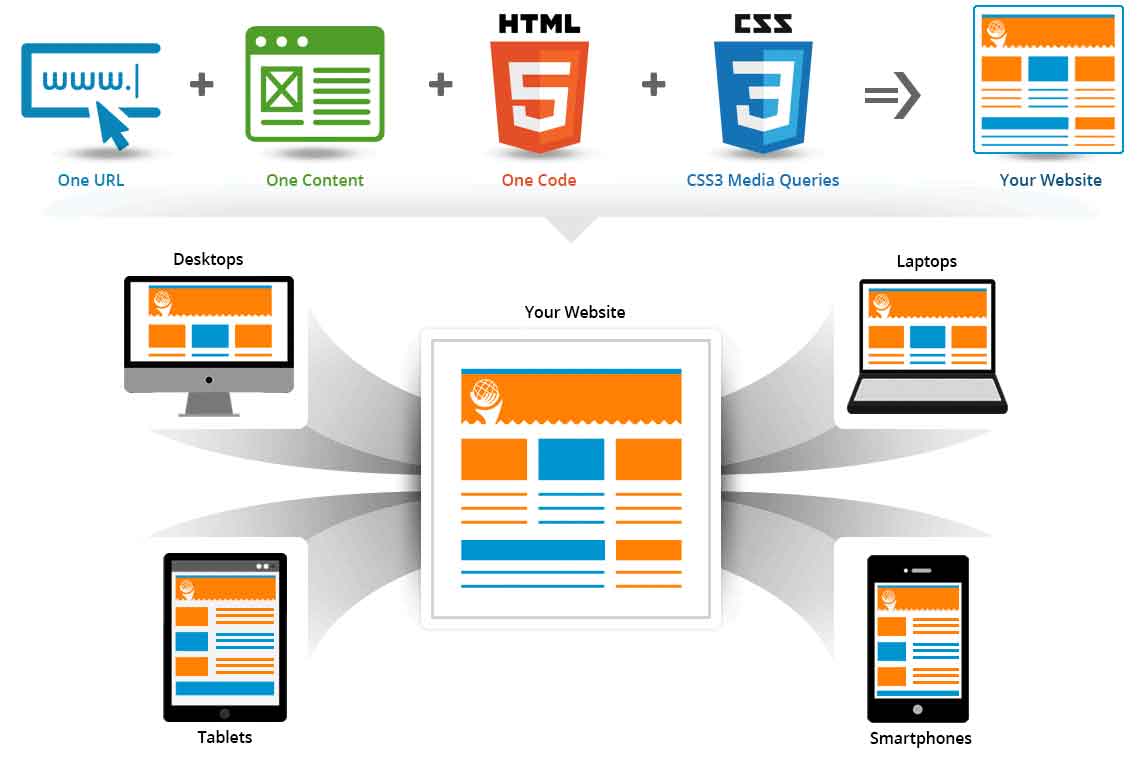
Responsive web design is a design of pages on the Internet that allows you to get the correct display of a web resource on any devices connected to the network (smartphones, tablets, laptops, PCs). Good example of website design adjusts to the parameters of the browser window, which are set by the user or device.
Responsive web design and mobile traffic growth
Today, such a site page design is not just fashionable, but necessary in web development. This is due to the large number of different devices and platforms that differ in different resolutions. The responsive version of the site will work on all platforms with any resolution. This allows you to spend less effort to implement the idea, and also costs the customer much cheaper to develop a separate mobile version and a version for PC.
According to the latest research by TNS Web Index, it was noticed that in the past few years only 29% of users visit websites from computers. But more than half use computers and smartphones or tablets. So web design examples are rather important.
What is responsive web design
It makes it easy to browse the same site on both computers and mobile devices. However, you will not feel any discomfort. Responsive design allows you to display pages and their content in accordance with the device on which the user opens them.
For different sites in web design and development agency trends there are a few different trends:
- rubber – it is simple to implement, the main blocks of the web page are compressed to the width of the device on which the user is viewing it (if this is not possible, then the blocks are rearranged in one row);
- transfer – if you have a multi-column site, then this method is obvious;
- switching is the most easy-to-read way, based on the development of separate layouts for screens with different widths (differs in laboriousness);
- simple adaptability – suitable for sites with a simple design, is distinguished by simple scaling of typography and images;
- use of panels – the appearance of a vertical or horizontal menu when you click on a special button in web design examples.
Responsive email design
Just because your email looks good on a desktop doesn’t mean it will look the same on a mobile device. Modern website navigation designs attract users. That is why the adaptation of the mailing list for any device is a very important part of the business. Most of the audience of various companies that are engaged in email marketing opens messages on smartphones or tablets in website navigation design best practices. According to a 2011 Campaign Monitor study, about 20% of all email openings occur on mobile devices. Today this figure is much higher.
Why should a website be responsive?
There are several main points here:
- Today, users use a wide variety of devices with which to access the Internet. They all differ in screen size and resolution, so the website on each of them will display in a different way;
- Today, the popularity of mobile devices continues to grow at a rapid pace, Internet traffic is increasing, so a significant part of the audience of any company browses the site from smartphones or tablets;
- if urgent information often appears on your resource that the user can read at any time on the phone, then responsive design is a solution.
The main differences between responsive design and mobile version
Without first understanding the topic, many customers think that different versions of the site are the same in website navigation designs. But there are many differences here. Mobile design is developed to look at the page on a small screen. It easy solves the problem with the usability of the site.